CF Napa Refreshes Flora Springs’ Flagship Wine
Flora Springs came to CF Napa to refresh their flagship wine – Trilogy – to reflect the winery’s redirected focus to direct-to-consumer sales and premiumization. Trilogy is one of the winery’s most sought-after wines, so it was imperative that the redesign was respectful to the wine’s key equity elements and maintain its traditional Napa Valley sensibility consumers have come to know and love
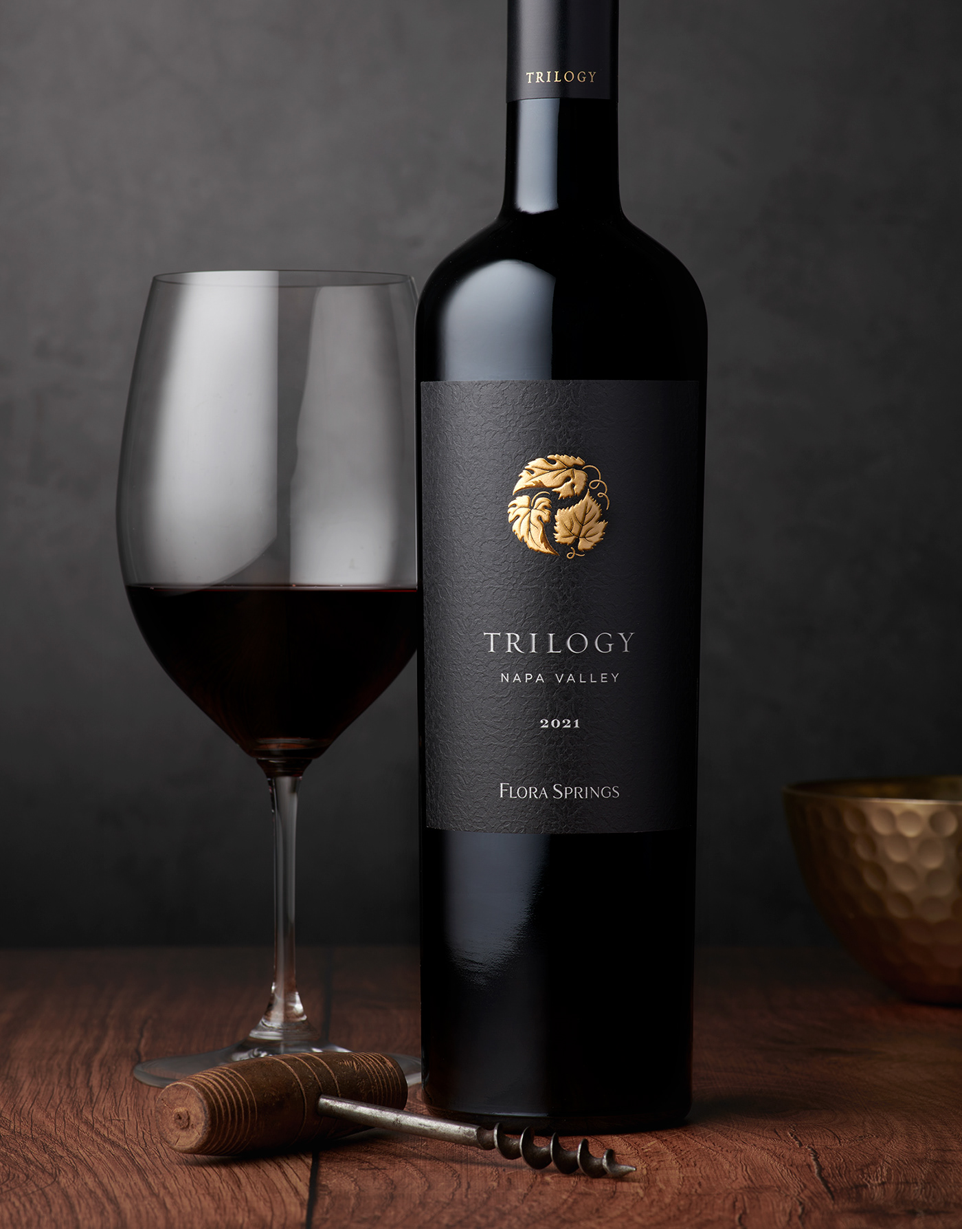
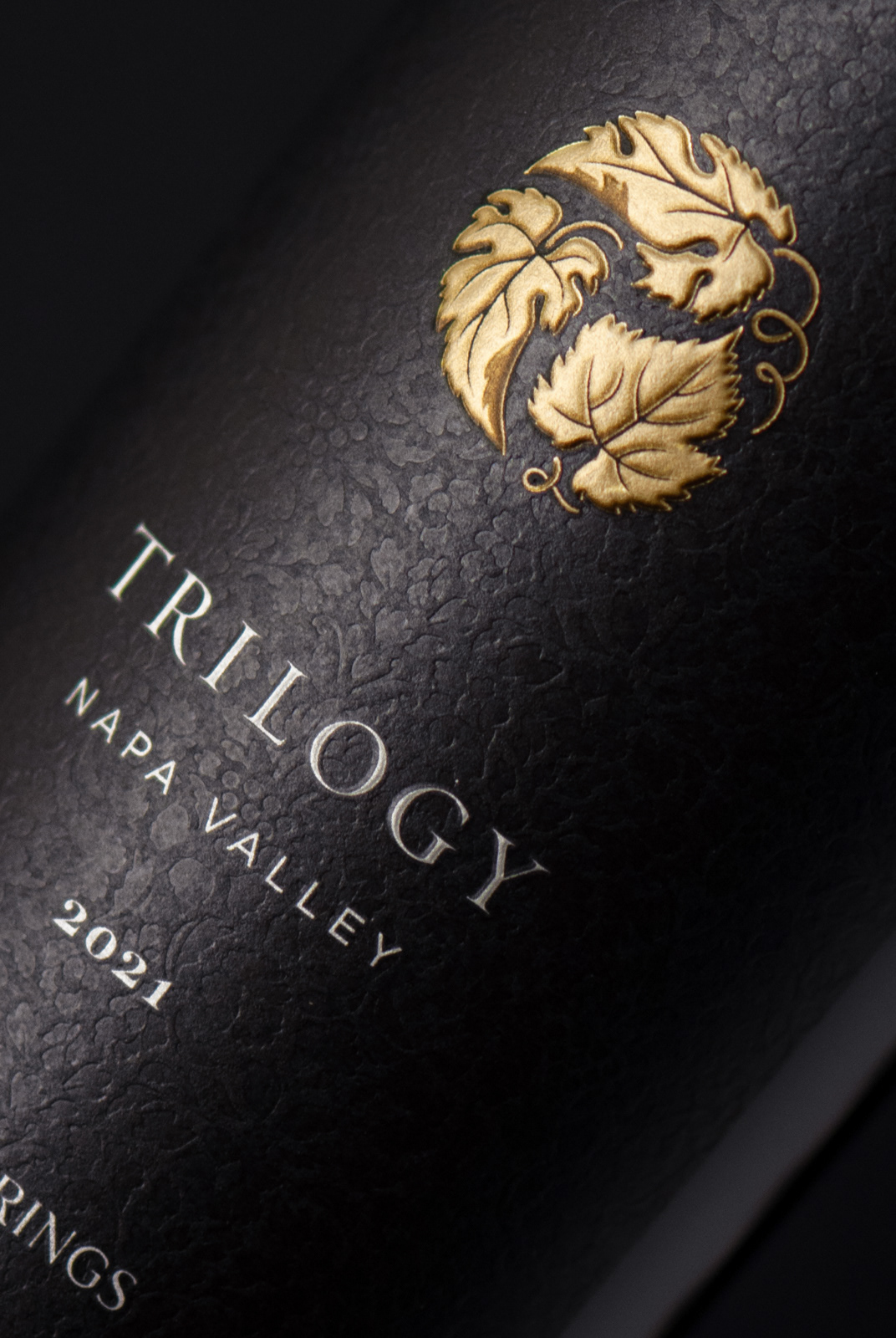
CF Napa refined the three-leaf Trilogy icon and accentuated it in a gold foil sculpted emboss to show off the texture and detail of the illustration.

The Trilogy wordmark was recreated in a more contemporary typeface and the Flora Springs brand mark was completely reimagined as a custom-drawn wordmark. These details, along with the minimalistic approach to the display of wine information on the front, contributed to the modernization of the label. The final touch was a custom grape leaf pattern that was blind debossed into the background of the label, providing a textural element and a point of discovery for the customer.


Drink With Your Eyes®


